
PwC, one of the world’s largest professional services firms, has come under fire for unveiling a new global brand identity during a period of significant internal restructuring and layoffs.
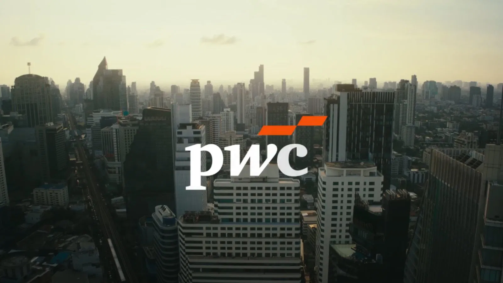
On Tuesday, the company revealed its updated logo retaining its existing font but replacing its distinctive multicoloured “butterfly” crest with a minimalist design of two orange parallelograms.
The firm described the change as its “first global brand update in over a decade,” positioning it as a modern reflection of the company’s current ethos: “fast, sharp and focused on what’s next.” However, the reception has been far from welcoming.
Employees on platforms like Reddit and LinkedIn expressed outrage, confusion, and disappointment over what many view as a costly and unnecessary exercise in brand aesthetics at a time of financial restraint and internal unrest. “I can’t understand why so much money is being spent on rebranding,” one anonymous employee wrote. “The ‘old’ logo was beautiful. Instead, savings are being made on staff.”

The backlash reflects a deeper sense of disillusionment among PwC’s workforce, many of whom have been affected by sweeping job cuts across the company’s global operations.
Cost-Cutting Behind Closed Doors
The rebranding comes amid PwC’s efforts to reshape its operations and reduce expenses. The company has been contending with a global consulting slump, leading to significant headcount reductions and program suspensions.
ALSO READ: Call for Cyber Experts: Join FCRF Academy as Trainers and Course Creators
In the US, PwC slashed around 1,800 jobs in late 2023 the first formal layoff since 2009 representing about 2.5% of its American workforce. In the UK, reports from the Financial Times revealed a wave of “silent layoffs” in mid-2023, where departing staff were instructed not to disclose reasons for their exits.
Simultaneously, the company has severed ties with 123 partners and halted its technology apprenticeship program. Insiders attribute the aggressive cost-cutting to pressure from remaining partners who are eager to maintain remuneration levels after consecutive years of reduced annual payouts.
Adding to the scrutiny is the firm’s ongoing investment in high-profile partnerships. The rebranding coincides with PwC’s new sponsorship agreement with Formula 1, under which the firm will provide consulting services to the motorsport enterprise. Critics argue this juxtaposition of flashy brand initiatives and internal austerity only widens the gap between leadership priorities and employee welfare.
Critics Call Out “Lazy” Branding
Branding professionals have also voiced skepticism over the creative merits and financial prudence of the new identity. Some call the change “lazy,” adding: “Somebody’s charged them money for not doing very much.”
PwC has declined to disclose the total cost of the rebranding. However, marketing analysts estimate that agency fees, handled by McCann one of New York’s top advertising agencies could run into the hundreds of thousands of pounds. Factoring in the global overhaul of signage, stationery, and digital assets, the broader cost is likely to reach several million.

The muted aesthetic of the new logo has also drawn ridicule. One employee quipped that the stripped-down design “perfectly represents all the business areas they’ve cut.” Another compared the removal of the iconic colour motif to the company’s stripped-down operations.
Despite the outcry, a PwC spokesperson stood by the rebrand, stating it “better reflects our work today.” For a company that last rebranded in 2010 after changing its name from PricewaterhouseCoopers to PwC a transition that took eight years the message this time appears rushed, costly, and ill-timed to many observers.